Blaugust Eve: The Lair get a facelift
‘Twas the eve before Blaugust, and in her room in her house, Faeldray was furiously coding, with both keyboard and mouse.
Yeah, that’s as far as I’m going to even attempt to take that rhyme. The point is that there’s two things I want to talk about.
Revenge of the Blaugust

The first is that I’ve joined the Blaugust challenge this year, which means that I’m going to try to post every day for the entire month of August. Which starts…well, tomorrow, meaning that you’ll be hearing a lot more from me in the coming 31 days. I can’t promise quality posts for the entirety of it but I’ll do my best to hide that sometimes I’ll be scrambling for things to say. I also might go a little crazy and talk about all sort of random things but hey, you can blame it on Blaugust!
If you’d like to participate, there’s no problem in joining a little late, just head over to Tales of the Aggronaut to find get more info.
The Lair gets a redesign (again)
I know, I know, the last redesign was less than a year ago. I’m pretty sure this makes me a special kind of crazy. But I’m currently working on a redesign for work where I don’t get to make a lot of choices and yet I have all of these fantastic ideas…so that creative energy has to go somewhere.
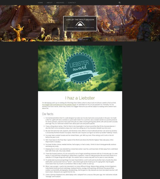
Minimal and modern is what I was going for, with more of an emphasis on images now that I’m getting better at taking screenshot. Let’s face it, I had gone a little crazy with sidebars and widgets previously. So with inspiration from themes like BlogBox and Skilt, I completely removed the sidebar and reduced the number of widgets down to two, just Tags and the Blogroll which are both in the footer now (along with the social icons). Featured images for posts are no longer tiny squares but much more prominent elements on the page. The latest post is now shown in full on the homepage (no more “read more” buttons) so it’ll be less clicking and I won’t have to remember the Read More tag all of the time. Everything else just has excerpts. And I kept the random image header at the top of the page because that was my favourite feature from the old design.
At least I was able to reuse a lot of the code from the old design so I didn’t have to reinvent the wheel. I had a hell of a time figuring out how to do some of the newer stuff though, especially the images and excerpts for previous/next post links. It took many hours of searching before I found enough information to cobble that code together. But hey, it might make a good Blaugust post.
I’d also like to mention that I also took some ideas from the themes for Waiting for Rez and MmoQuests.com so you might see a few similarities there. Great themes by the way, guys.
Please feel free to check out the new design and do your best to break it. I’d like to know if anything goes wonky so leave a comment or contact me if that happens. The caveat is that Internet Explorer 8 and below (and similarly older browsers) are off-limits. I already spend too much time in my job trying to design for those crappy old browsers that I don’t want to do it in my free time too. But otherwise for desktops, tablets, smartphones…anything goes!


I like it! It’s very striking. 😀
Thank you!
I love your header, and the rest of the layout too ofc but that header <3
Thanks! I love it because it’s a really great place to showcase some of my best screenshots (and a few pieces of concept art from my favorite games).